~5pp
drop-off reduction
Nigmat Salibayev
~5pp
drop-off reduction
~19%
more issued cards
Add Mastercard business cards to the card opening flow.
On paper — a straightforward UI update. In practice, it became a reason to fix something that had been quietly hurting conversion for a while.
I pulled funnel data from the analyst — exit rates by screen. Then cross-referenced with existing user research from the discovery team to understand what customers actually care about when choosing a card.
Two sources, one clear picture. What started as adding a new card became a reason to redesign the entire selection experience.
A week before the sprint, I came to grooming with a proposal: don't just add Mastercard — redesign the entire card selection section.
The argument was simple: we had data showing the drop-off, we had research showing what users care about, and we had a two-week window. The team agreed.
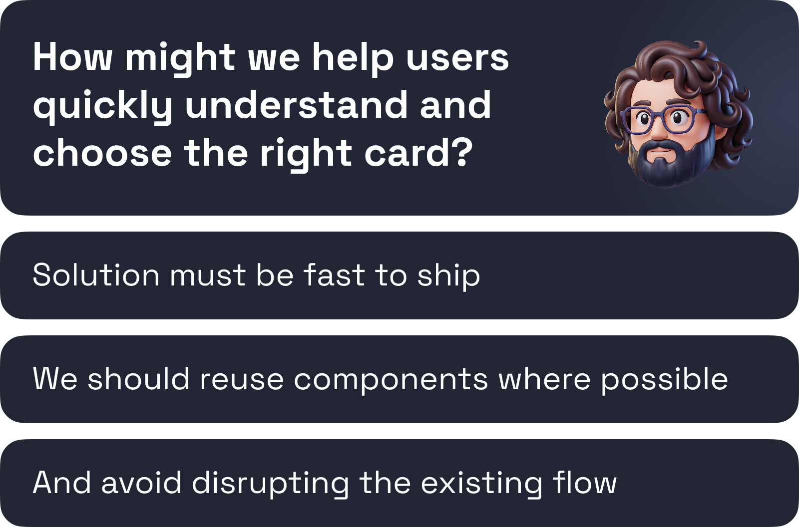
The question shifted from "how do we add Mastercard" to "how do we help users choose the right card."
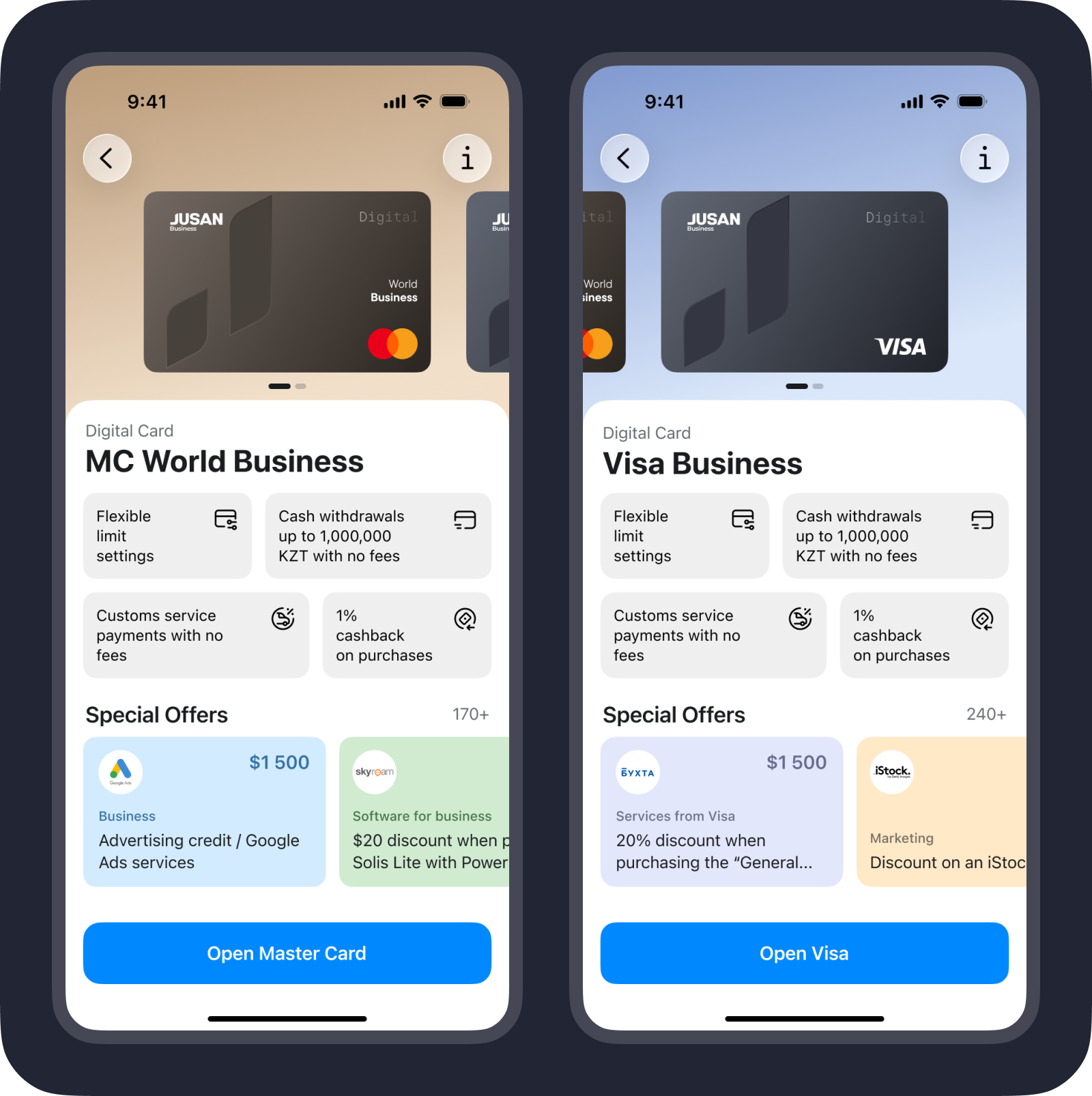
Each card got its own colour theme — not just a label swap. The goal was to make the choice feel distinct before the user even reads the name.
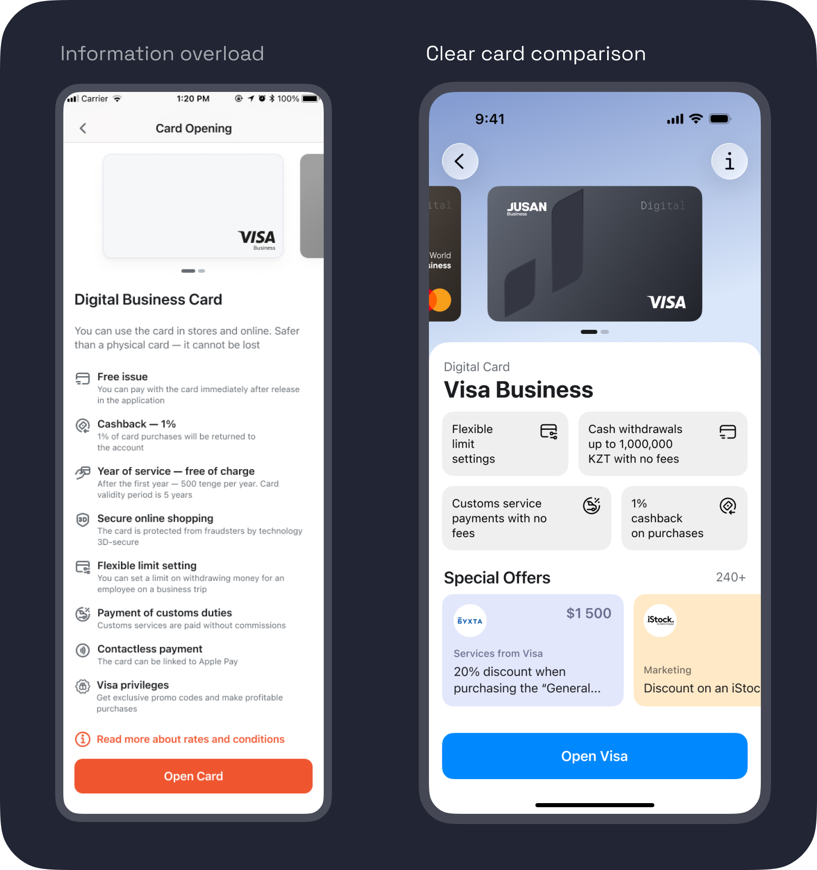
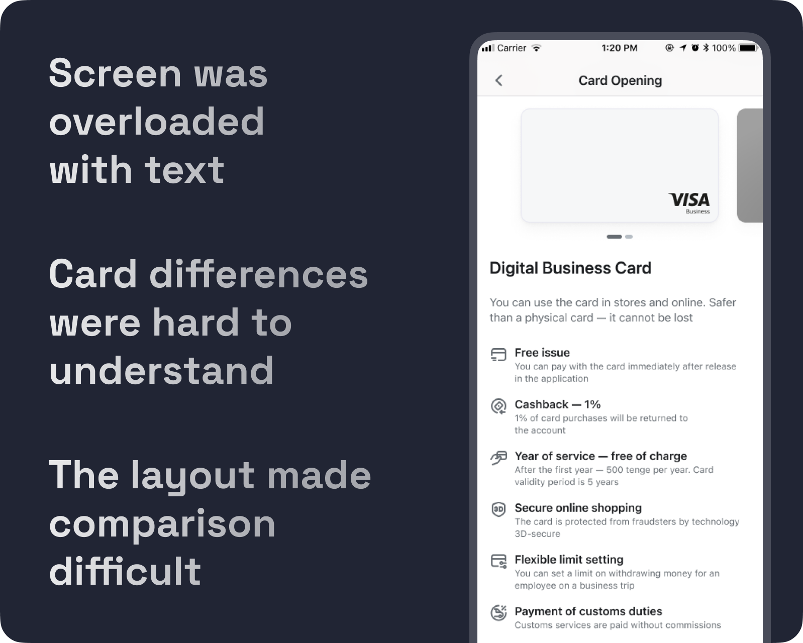
The old screen listed 8 features — contactless payment, 3D-secure, free issue, year of service. Generic. Every bank has these. I cut them and kept the 4 that actually matter to business customers: flexible limits, cash withdrawals, customs payments, cashback.
Partner offers did the rest. Visa and Mastercard have different deals — 170+ vs 240+. Jusan was the first to surface them inside the app. This became the main differentiator between the two cards, and the real reason to scroll.
Two weeks, one sprint. Some implementation details were simplified for faster development — a deliberate trade-off to hit the deadline without cutting the core experience.
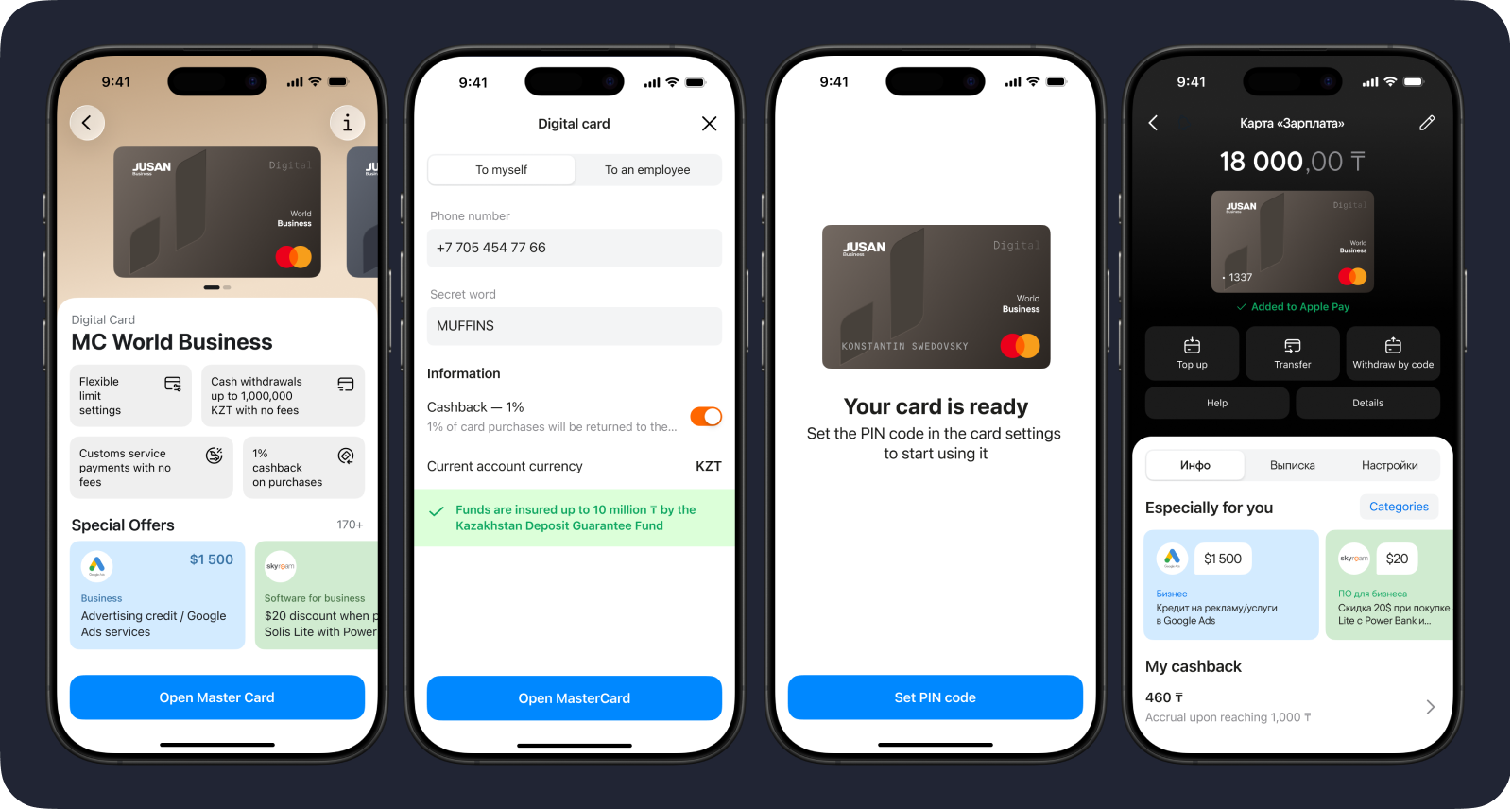
Shipped in close collaboration with developers and analysts.
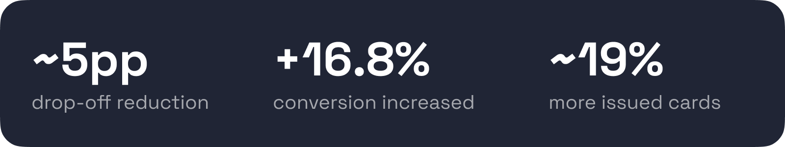
The redesigned flow reduced drop-off on the first screen of the card selection flow and significantly improved conversion.
+16.8% conversion on average across platforms · ~5pp drop-off reduction · ~19% more issued cards